Feature
Champion special: Behind the visor – Nyck de Vries

__We went behind the visor with Formula 2 Champion Nyck de Vries to discuss the design of his helmet and delve into the back-story of where it all began.
The ART Grand Prix driver explains the Dutch story behind his lid and which part of it always gets confused for love hearts.__
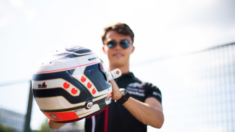
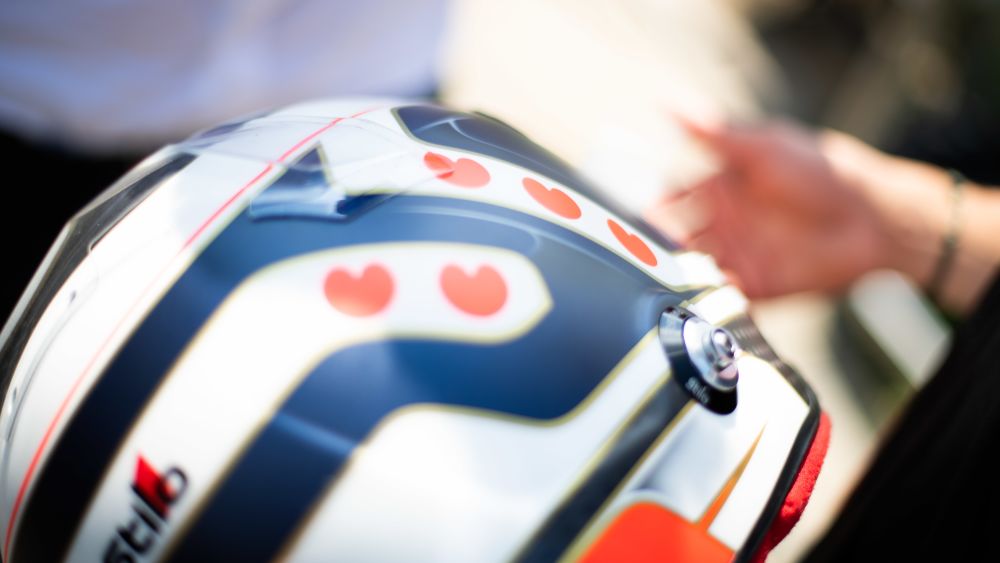
“To be honest, the basics have remained the same for a very long time. I think I have had this design pretty much since 2008, so more than 10 years. Obviously, there have been little changes here and there, but the basics have always remained the same. The colours are mainly blue, white and red, which are the colours from the Dutch flag, but also the colours from our province flag.
I have always had the hearts on my helmet, which represent my province flag. The white stripes with hearts in between, that is our flag, with the blue background. They are not actually love hearts, they are waterleafs. A local football club, who are in the Dutch division, has those hearts on their shirts - SC Heeraveen. I like to keep things similar and people recognise the hearts - which are actually waterleaves, but that is fine.

I always have a matte finish, because I think the colours come out nicer with matte. I have had matte for a while as well and I haven't changed things very much over the past few years.
The base of my helmet has always been the province flag and we kind of made the design around that and I done some drawings myself and there was a local designer / friend, who made something of it. The helmet painter then made his version of it. I have just made small tweaks here.
For the design and painting, I work with two companies. There is Lucky Designer, who paint all of my helmets. Then, I have a guy called Nicolaj Jacobsen, who is Danish, and his company are called NJ Design. Lucky Design have always painted my helmets and we have been loyal to each other. We have worked together since karting.”