


Feature
A touch of traditional Russia and a stand-out gold design: the story behind Shwartzman’s helmet
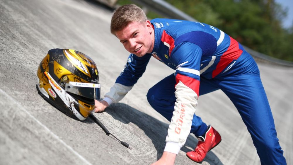
Ahead of his home race at Sochi in Russia, we went behind the visor with Robert Shwartzman to discuss his helmet design and the inspirations behind it.
The PREMA Racer talked us through the traditional Russian elements of the design, the gold colour scheme and how it was influenced by his late father.
“My very first design was just an off the shelf white helmet with blue and red dragons on,” said Shwartzman. “It wasn’t until I was starting my career in junior karting in Italy when I was around six years old that I came up with a design. Me and my dad were looking at designs and he told me that I needed a design that I could use for my whole career – something that represented me, and only me.
“We were looking at a Russian artist’s designs on his website and there was a helmet with gold flowers. The flowers are called Khokhloma, they’re a traditional Russian flower. They often appear on the Matryoshka Russian dolls. I really liked the gold design, no one had a gold helmet, even in Formula 1. My dad had a flower business as well, so it matched that.
“I took that design, and it was bringing me good results straight away, everybody could recognise me. I was being called the ‘gold helmet’ in Italian karting, the helmet was easy to see in the pack, despite there being so many karts.
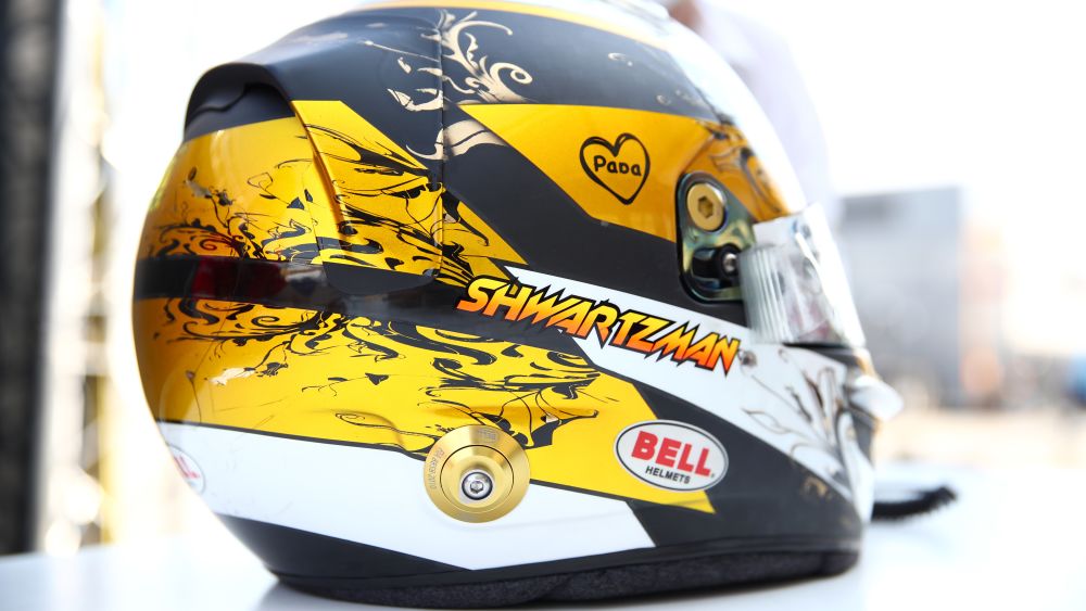
“I have added things and modified it slightly since then, there is the matt carbon on there now that I love. On the top, there is the orange/yellow gradient, which was an idea that my designer Uffe Tagstrom came up with. He has also designed helmets for people like Sergio Perez and Kimi Räikkönen before. He came up with the idea on the top and I thought that it was pretty cool.
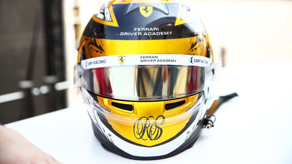
“My logo on the front is similar to my signature, my signature is in this style and it’s how I wanted my logo to look. You can make out the R and S, so you know that it’s me. Then there is my dad’s sticker. I came up with this design with Angelina Ertsou, (PREMA's Media PR). I wanted to have this sticker on my car and my helmet, it needed to be simple and easy to understand, so I chose to just have a heart and write papa. I really love the design, I think that it’s beautiful, it’s special to me.”