Feature
Schumacher reds, Miami blues and a touching tribute: Jake Hughes on his F2 helmet

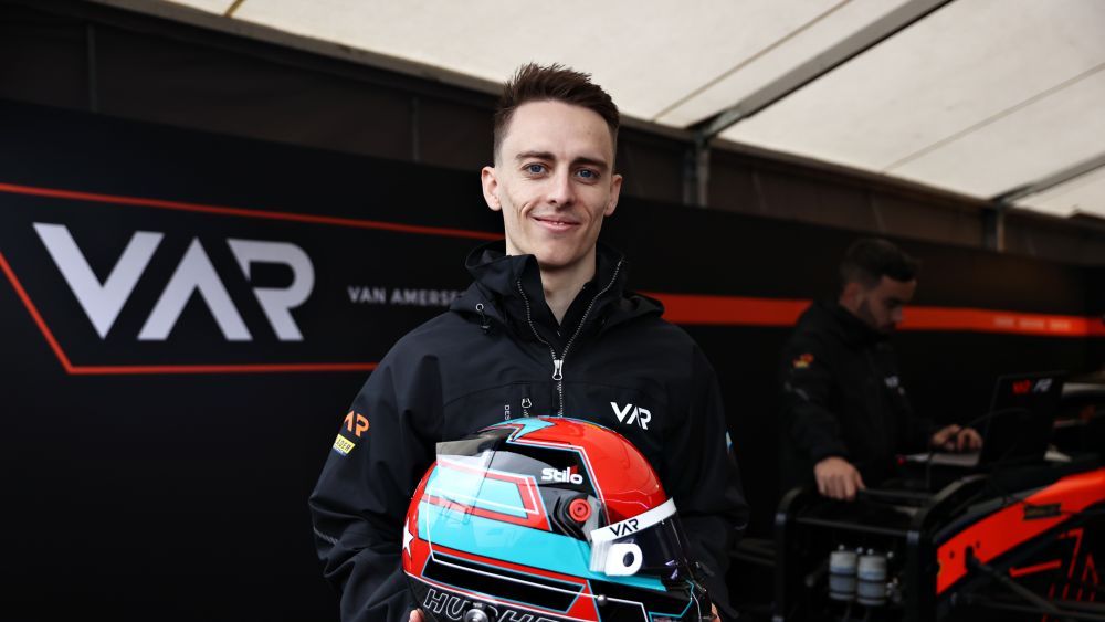
It has undergone some changes recently with the arrival of Van Amersfoort Racing in Formula 2, but Jake Hughes says he has kept his helmet design pretty simple in recent years.
We caught up with the British driver and asked him to walk us through all the details, decisions and background on his crash helmet design.
“I can’t remember what my first helmet looked like. This is a proper admission, it was basically a copy but in a different colour to a karter at the time who was the guy to beat. I started karting quite late so I never had a chance to do Europe but once I became aware of WSK and CIK and these categories, I started watching the races on YouTube and Facebook and things.

"There was this Polish driver called Karol Basz, I think he raced Ferrari GT cars at some point, but he was the guy to beat, so I copied his helmet design and just changed the colours around a bit because I had no imagination at all.
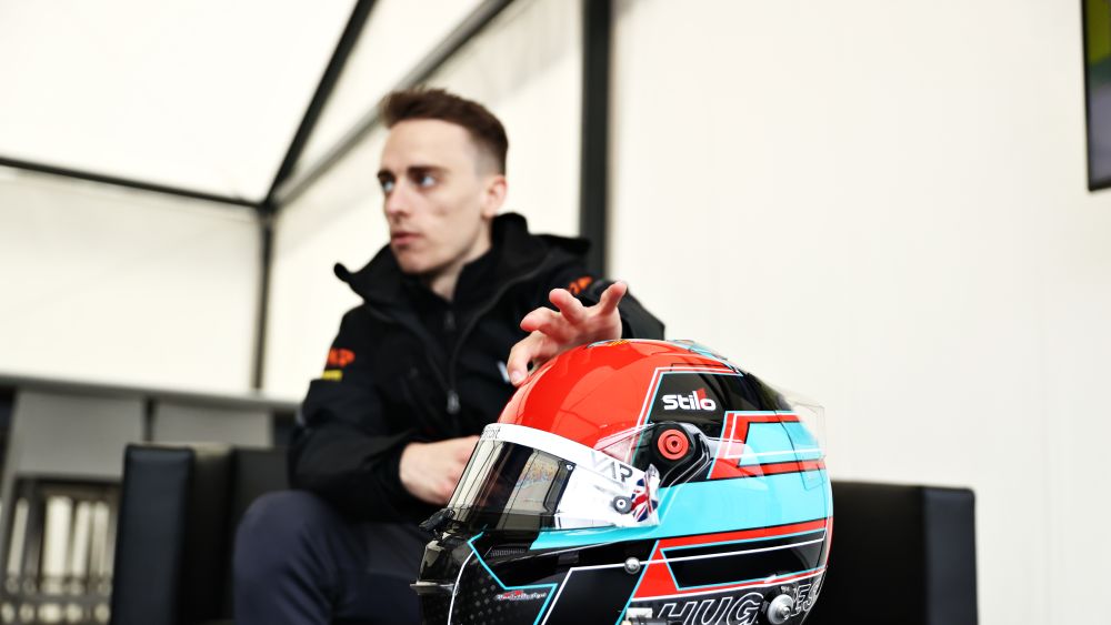
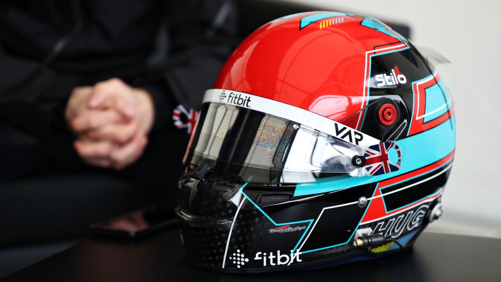
“This helmet design though is from 2020 and 2021. The colours are swapped around now so the Miami blue and Schumacher red, as the painter calls it, used to be the opposite way around. The front of it was blue last year and where the blue is now, that used to be red. My helmet started to get a bit complicated in 2018, there was a lot going on.
"I tried to simplify it a bit or tried to make it look better with block colours. In the paddock it looked good, but I noticed on the TV it wasn’t standing out, so I wanted something that ‘popped’ a bit more. So for this year with Van Amersfoort Racing, I tried to swap the colours around so it fit with the car. With the HWA I was driving, the Miami blue on the front looked perfect but with VAR, I went to the red at the front so it aligns a little bit better.
READ MORE: Monaco memories: The story behind Théo Pourchaire’s first-ever limited edition helmet

“I’ve always liked blue and red, they’re my favourite colours. I’ve always had an orangey-red as a second colour. The helmet painter, when I made my 2020 helmet for F3, he saw my design and said ‘why don’t we change the style from a blue to Miami blue?’ And I really liked it. The Schumacher red always works. Like I said, I have no imagination with these things and I cannot think of designs or colours so it was led a lot by the helmet designer. I think it really works. They’re two stand-out colours.

“This is my logo on the top. It might not come across but it’s basically a ‘J’ and a ‘H’. It doesn’t look as obvious sometimes but after someone’s pointed it out it makes sense. We did that so on the onboard camera picks it up. When I saw it in Bahrain, I thought it does come across. I had a few little instances of this claret and blue for my favourite football team – Aston Villa.
“I only started karting when I was 16 because my whole family loves football. I played football until I was about 17 or 18. My life was football as a teenager and it still is away from racing. So I’m always talking about Villa on Twitter, sometimes a bit too much actually. Obviously I had to incorporate them somehow.
READ MORE: Bruno Michel’s Debrief: A breakaway battle for the title

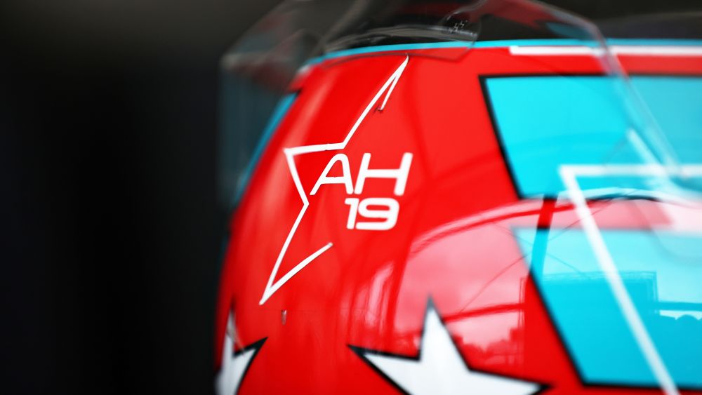
“My favourite part on the helmet is the back element. The Anthoine (Hubert) sticker is there, but these two stars – this was the star he wore on the side of his helmet. I just wanted to carry my own little symbol of him. We all miss him and I think I’ll always carry this in some aspect around the helmet with me. That’s my favourite touch on the helmet, just to feel like he’s there with me. Hopeuflly he’s helping me on the track a little bit. Otherwise, I’ve got my surname on the side, some sponsor logos and the Union Jack for the visor sticker.
“The designer is Sean Bull, he designs the Alpine F1 car livery. He’s really good. The painter is Daniel Designs in Italy. The helmet is given to me by Stilo, but I don’t know if he’s in-house with Stilo but they offered his services to me when they gave me the helmet, and I think he does a good job.”
READ MORE: Paying tribute to his dad, the story behind Clément Novalak’s helmet design