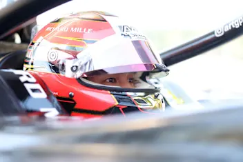
Tatiana Calderon's popstar-painted helmet
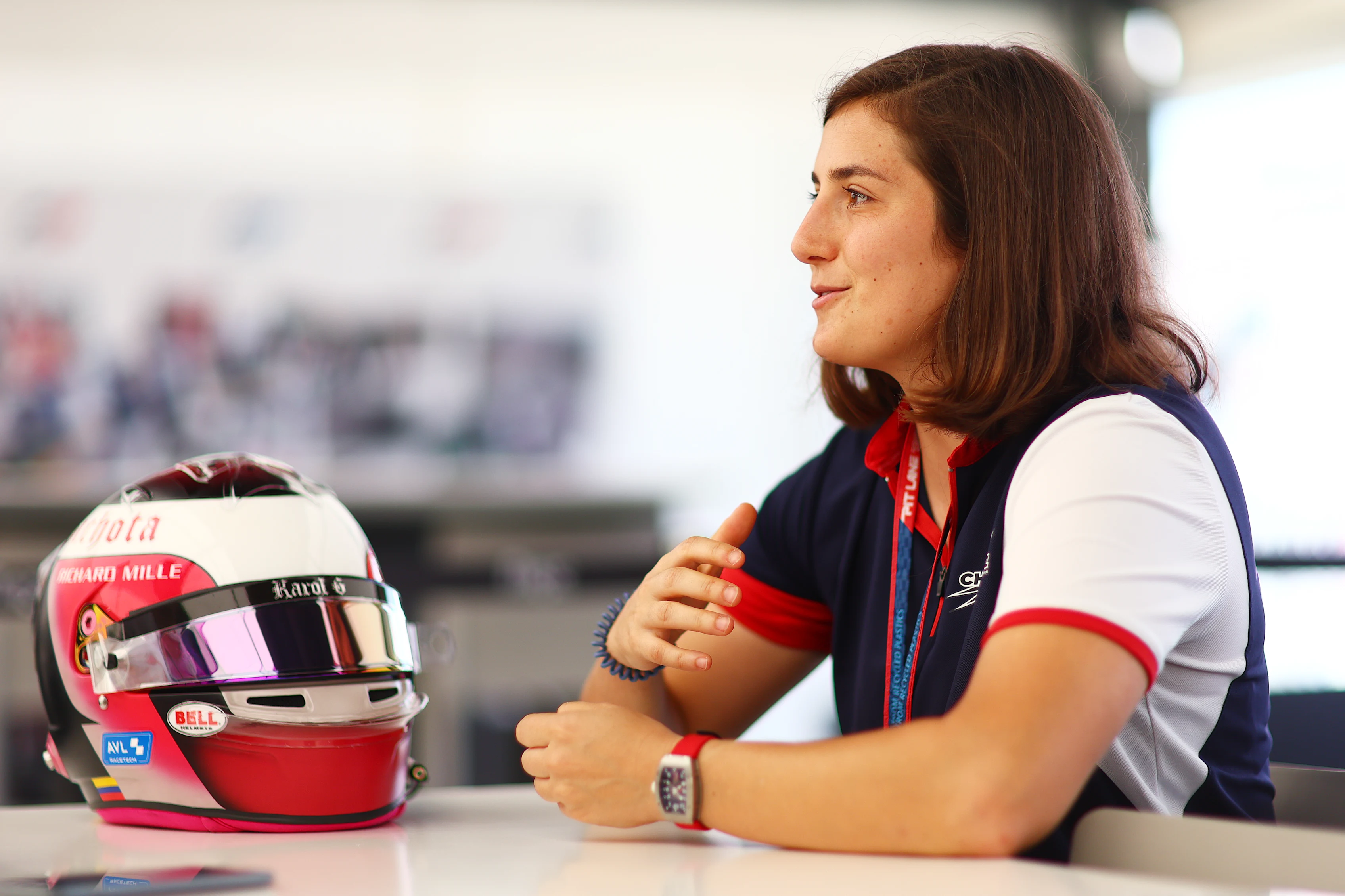
Tatiana Calderon has one of the more unique helmets on the Formula 2 grid, in no small part due to it being designed by Colombian popstar, Karol G.
The Charouz Racing System driver talks us through how the design came together, which parts of the helmet are her favourites and what changes she might make for the future.
"My first painted helmet was actually like Lewis Hamilton’s design back when he was using Ayrton Senna’s colours. They were similar colours to the Colombian flag. I didn't put the green on it but I picked Colombian colours with that design. Then I started to have a ‘T’ and a ‘C’ design on there, and later on there was a butterfly when I started racing in Japan racing there, to symbolise like starting to spread wings and that sort of thing. Now I have a more clear design, with meaning and things that I like.

"This one is actually designed by Karol G. I told her you have the liberty to do whatever you like with it. The thing I wanted to keep from the old design was my butterfly. I didn't know how it was gonna turn out but when I saw it painted, I was immediately like ‘I love it!’. I wanted to combine both of our signs that people would recognise as ours. So her heart with the stitches on the back of the helmet, protecting the loved ones and your own beliefs. And then the meaning of ‘Bitchota’ but she wanted to completely change the meaning of the word by making it mean more of a badass, powerful woman. That's what that means.
"So for me, it was like super, super cool to send that message not only me but other girls out there so I’m super happy with the design. I also have the Anthoine sticker and Maria de Villota on the other side, because honestly, I think about them very often, day to day so it’s good to remember them.
READ MORE: Simulators, baseball and even more racing: Getting to know the real Ayumu Iwasa

“If I did a special version, I would like to have the colours of the where I'm going to be racing on the butterfly. That's something I did when I was racing in America. I’d have the American flag or the Japanese flag in that in some way on top of it. But other than that, I like the clear design, I quite like to just play a bit with the colours.
“I’d say my favourite part is the heart on the back, I wish it was more visible on the TV pictures because you have to turn around for it. I think it looks amazing on the black base, I was like ‘woah, that looks amazing,’ I just need to ask her for permission to keep it I like it so much.
“Pascal from Bell, he painted it. It looks so so good. When they prepare everything, they prepare so special, even the tearoffs. It’s way better than when you do it yourself. “
Next Up
Related Articles
 Inthraphuvasak revels in alternate strategy charge and top five finish in Spielberg
 QUALIFYING: Impressive Câmara beats Dunne to pole position at Silverstone
 WHAT TO WATCH FOR: Keys to success around Silverstone
 How to Watch Round 7 at Silverstone: TV, Session times and More
 Round 7 Post Feature Race Press Conference
 Ricci hails Bennett Sprint performance as TRIDENT continues to show F2 progress